
Overview
Every month’s trading range, drawn as a box, with two reference lines inside it: where the month opened and the middle of its range.
It’s a structural view rather than a signal. Zoom out and you can read a year of a symbol’s behaviour in a few seconds — which months expanded, which went nowhere, whether the ranges are growing or compressing, and where the current month sits relative to the ones before it.
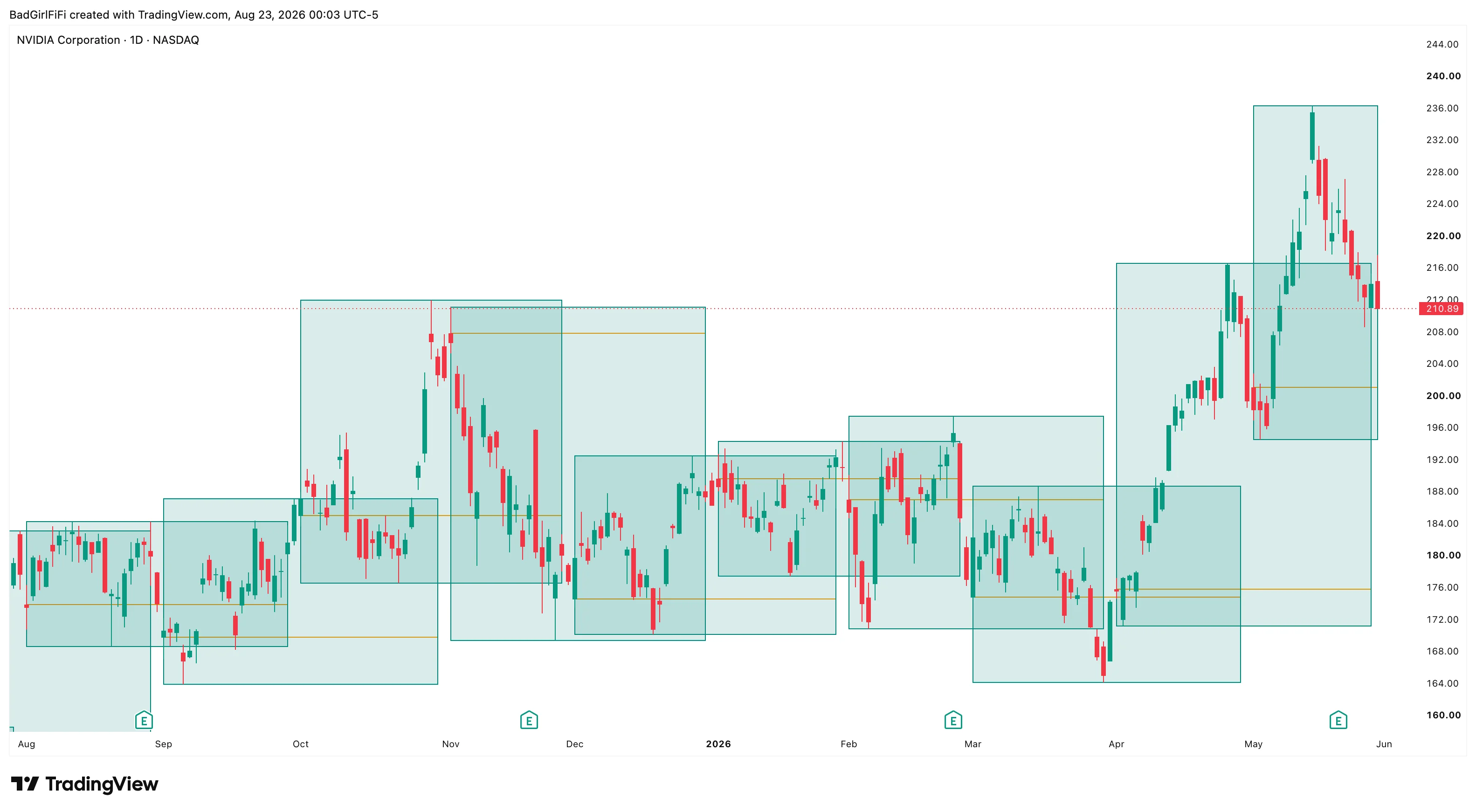 NVDA daily. Each box is a month’s high-to-low range; the orange line is where that month opened.
What it draws
| Element | What it marks |
|---|---|
| Box | The month’s full high-to-low range |
| Orange line | The monthly open — the price the month started at |
| Midpoint line | The 50% level of the month’s range |
Completed months are fixed. Once a month ends its box stops changing — that range is history.
The current month’s box grows with it. Its top and bottom track the month-to-date high and low, so it expands each time price makes a new extreme. Watching it widen is watching the month’s range being built.
Why the monthly open matters
The orange line is the more useful of the two internal lines, and it’s the one most people ignore.
Price above the monthly open means the month is green. Below it, red. That sounds trivial until you notice how often price returns to that exact level and reacts — it’s a reference a lot of participants measure performance against, which makes it a level with real memory.
A month that opens, runs, and then loses the open is a different month from one that never traded below it.
Why the midpoint matters
The 50% level of a range is the fairest price in it. In a month that’s been range-bound, price tends to oscillate around the midpoint; in a trending month, it stays on one side of it and the midpoint becomes support or resistance on the pullbacks.
The midpoint line defaults to white, which makes it invisible on a light chart. If you don’t see it, that’s why — change the colour in the settings to something with contrast against your background.
Reading the sequence
The value is in the pattern across boxes, not any one of them.
Expanding boxes — each month’s range wider than the last means volatility is building. Position sizes should be coming down.
Compressing boxes — a run of narrow months is a coiled market. Compression precedes expansion.
Stacked higher, no overlap — a strong trend. Each month trading entirely above the previous month’s range is about as clean as structure gets.
Heavy overlap — months covering the same ground are a market going nowhere on the timeframe you’re looking at, whatever the daily chart feels like.
Settings
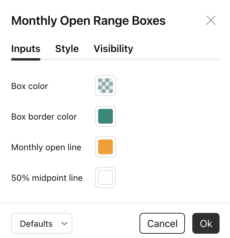
Four colours, nothing else.
| Setting | Default |
|---|---|
| Box color | Teal, heavily transparent |
| Box border color | Teal, solid |
| Monthly open line | Orange |
| 50% midpoint line | White |
The box fill is deliberately faint so candles stay readable through it. If you run several months on screen at once and find the overlaps too heavy, take the fill transparency higher still and rely on the borders.
FAQ
Which timeframe should I use?
Daily is the natural home. It also works on 4-hour and 1-hour if you want the monthly structure while trading a lower timeframe — the boxes just get very wide.
Why can't I see the midpoint line?
It defaults to white. On a light chart it’s invisible until you change the colour.
Does the current month's box change?
Yes — it expands as the month makes new highs or lows. Completed months are frozen.
Does it repaint?
Completed monthly ranges are settled and don’t change. The current month’s box updates as the month develops, which is what it’s supposed to do.
Can I use it on futures or crypto?
Yes. Anything with monthly data will draw, though instruments trading continuously will have month boundaries that follow the exchange’s own calendar.
Ready for the full engine?
This one is free. The Trade Qualification Engine is the paid suite it was built alongside.