
Overview
Sixteen sectors and themes, ranked strongest to weakest, colour-graded, sitting in the corner of whatever chart you already have open.
The point is that you stop guessing at the backdrop. Before you take a long in a semiconductor name, it’s worth knowing that semis are down 5.68% on the week while health care is up 4.52%. That is one glance, not a browsing session.
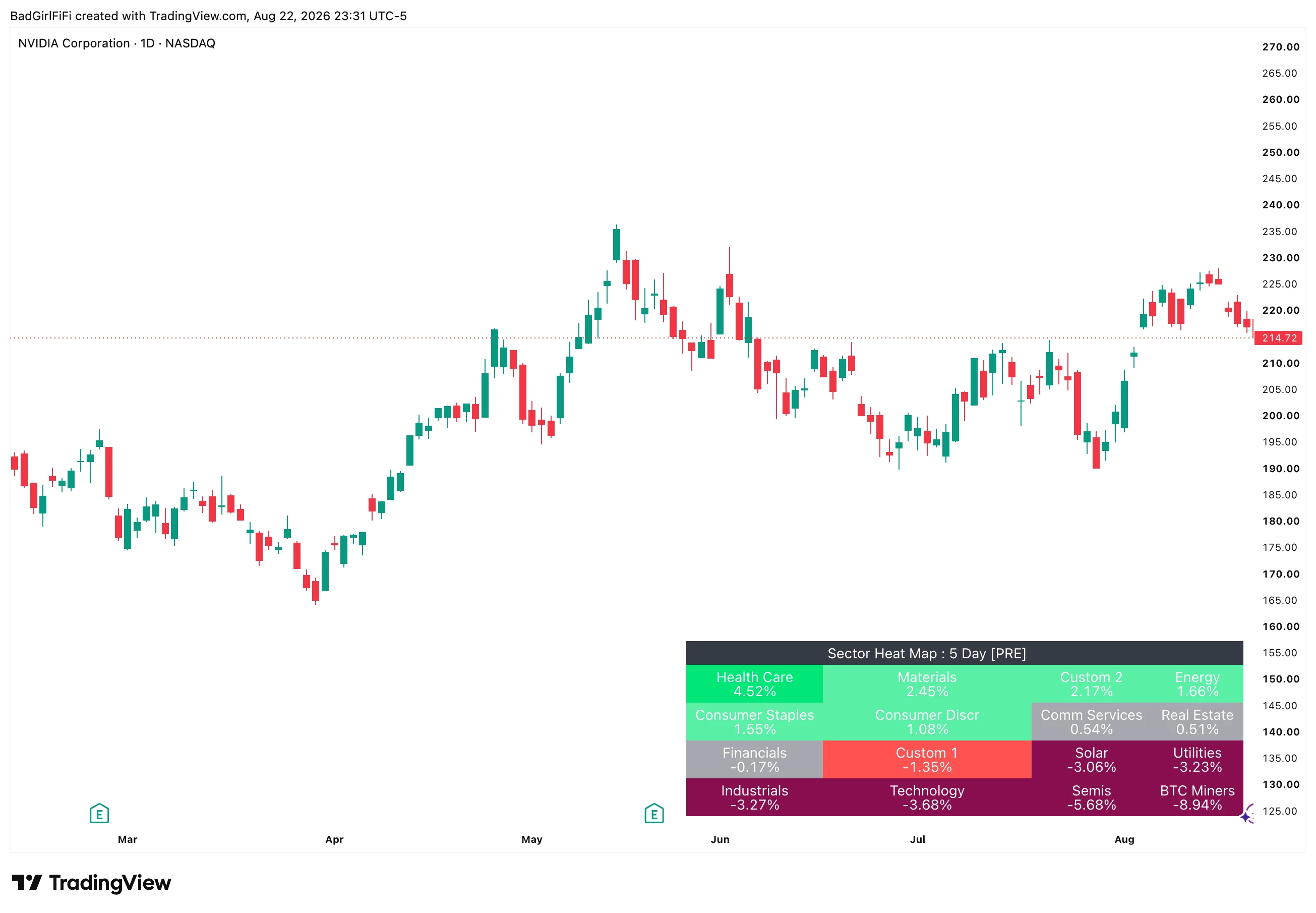 Ranked strongest to weakest, reading left to right and top to bottom. The header shows the lookback and, when relevant, a
 [PRE] tag.
It ignores your chart. The numbers come from the sector ETFs themselves, so they’re identical whether you’re on NVDA, ES or a 5-minute chart of something obscure. Leave it loaded and it costs you nothing.
Reading the tiles
Tiles are sorted by performance, strongest in the top-left, weakest in the bottom-right. Rank is positional — you don’t need to read the numbers to see the shape of the day.
Colour comes from five buckets, set by two thresholds:
| Bucket | Range | Reads as |
|---|---|---|
| Deep green | at or above Threshold 2 | Strong move up |
| Light green | between Threshold 1 and 2 | Up, meaningfully |
| Neutral (grey) | inside ±Threshold 1 | Noise — not moving |
| Light red | between −Threshold 1 and −2 | Down, meaningfully |
| Deep red | at or below −Threshold 2 | Strong move down |
Defaults are 1% for the neutral band and 2.5% for a strong move. The neutral band is the important one: without it, a sector up 0.2% would paint green and read as strength when it’s really just drift. Anything grey is telling you nothing is happening here.
Both thresholds are adjustable. Widen them for a 5-day lookback where moves are naturally larger; tighten them intraday.
What it covers
The eleven SPDR sectors — Communication Services, Consumer Discretionary, Consumer Staples, Energy, Financials, Health Care, Industrials, Materials, Real Estate, Technology, Utilities.
Three themes that don’t have a SPDR — Semis (SMH), Bitcoin Miners (WGMI), Solar (TAN). These move very differently from the sectors that contain them, which is exactly why they’re broken out.
Two custom slots. Point them at anything. Slot 1 defaults to IWM so small caps sit alongside the sectors; slot 2 defaults to DIA and is off until you want it. Name them whatever you like — the name is what appears on the tile.
Every symbol is editable, so if you’d rather track different ETFs entirely, you can.
Two ways to measure
% Change — straight performance over the lookback. What moved.
RS vs SPY — performance measured against the benchmark. What outperformed.
These answer different questions. On a day the whole market is down 2%, % Change paints everything red and tells you little. RS vs SPY tells you which sectors held up — and the ones holding up on a red day are usually the ones leading on the next green one.
Lookback is 1 Day or 5 Day. One day is today’s rotation; five days is the week’s trend and much less noisy. The header always shows which you’re on.
Premarket handling
The header carries a [PRE] tag before the opening bell.
This matters more than it sounds. Before 9:30 ET the daily bar hasn’t opened yet, so a naive percentage change would compare a live premarket price against the wrong reference and report nonsense. The indicator detects the session automatically and shifts its reference so that premarket numbers are measured against yesterday’s close, which is the comparison you actually want.
You get real premarket sector rotation, correctly calculated, before the open — which is when the information is most useful and when most tools are quietly wrong.
The tag disappears at 9:30 and the calculation switches over on its own. There’s nothing to toggle.
Alerts
Three modes, off by default.
| Mode | Fires on |
|---|---|
| None | Nothing. The default. |
| Thresholds | A sector crossing into a strong-move bucket |
| Top-3 changes | The leading three sectors changing |
Top-3 changes is the one worth considering. Sector leadership rotating is a genuine signal — if money left semis and moved into health care today, that’s worth knowing even if no individual name has triggered anything.
Layout and appearance

The tile grid is sized by Tile Columns — four across by default, giving four rows of four. Drop it to three for a taller, narrower block; raise it to six for a wide strip along the bottom.
| Setting | Default | What it does |
|---|---|---|
| Metric | % Change | Straight performance, or performance against SPY |
| Lookback | 1 Day | 1 or 5 days |
| Tile Columns | 4 | Grid width — 2 to 8 |
| Text Size | Small | Tiny through Large |
| Tile Padding | 1 | Horizontal space inside each tile |
| Tile Height | 0 | Extra blank lines to make tiles taller |
| Show rank # | Off | Prefix each tile with its position |
| Show Name (else Ticker) | On | “Health Care” rather than “XLV” |
| Heatmap Position | Bottom Right | Any of nine chart positions |
Thresholds, all five bucket colours, their text colours, the border, header and empty-cell background are all configurable under Heatmap Table Style.
Position it where your chart isn’t. Bottom right suits most charts, since price usually occupies the left and middle. If you trade a symbol that habitually runs into the bottom-right corner, move it to top left — the nine positions exist for exactly this.
FAQ
Does the chart symbol matter?
No. The heat map reads the sector ETFs directly, so it shows the same thing on every chart and every timeframe. Put it on one layout and forget about it.
Why is a sector grey when it's up?
It’s inside the neutral band — below 1% by default. That’s deliberate: small moves aren’t strength, and colouring them green would make every day look like rotation.
What does [PRE] in the header mean?
You’re looking at premarket data, correctly referenced against yesterday’s close. It clears itself at the open.
Can I track something other than sectors?
Yes. Every symbol is an editable field, plus two custom slots. Point them at country ETFs, factor ETFs, crypto proxies — whatever you actually rotate between.
Why are Semis, Miners and Solar listed separately?
Because they behave nothing like the sectors that technically contain them. Semis inside Technology, and miners inside anything, will hide moves that matter to you.
Should I use % Change or RS vs SPY?
% Change to see what moved. RS vs SPY to see what led. On a broadly red day, RS is the more useful of the two by a distance.
Ready for the full engine?
This one is free. The Trade Qualification Engine is the paid suite it was built alongside.