
Overview
Every gap between one session and the next, drawn as a zone and left on the chart until price actually deals with it.
This one stays on my charts, regardless of timeframe. It’s how I see where to find support, rejection, or the magnets of unfilled gaps.
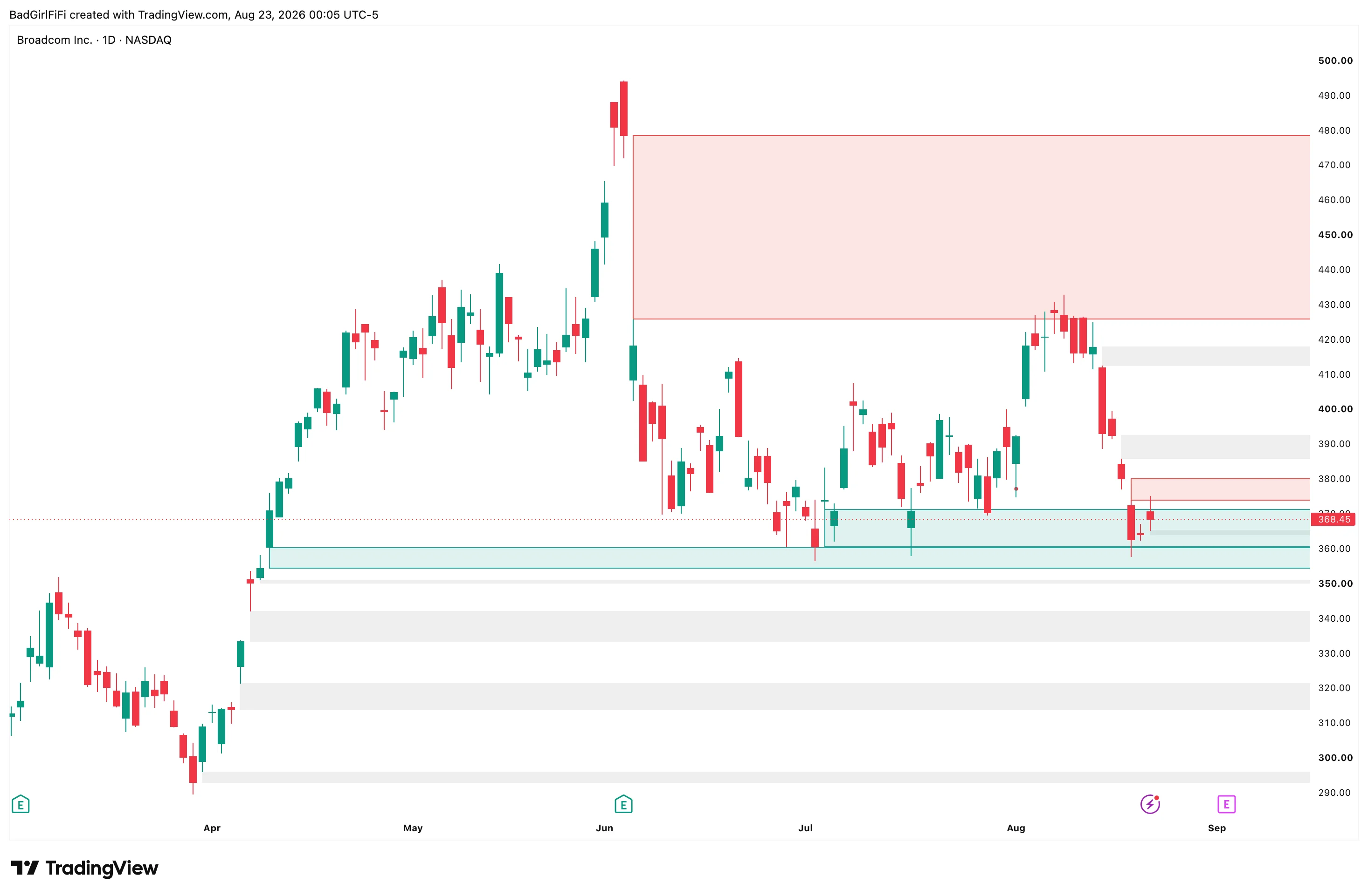 Grey zones are untouched. The red band above is a down gap price has traded back into — resistance. The teal band below is an up gap acting as support.
Three states, three colours
This is the idea that makes it more than a gap marker.
| Colour | State | What it means |
|---|---|---|
| Grey | Untouched | Price hasn’t returned to this zone since it formed. It’s a magnet — an area price has never traded through. |
| Teal | Support | An up gap that price has come back into. It’s now being tested from above. |
| Red | Resistance | A down gap that price has come back into. It’s now being tested from below. |
A zone changes colour the moment price re-enters it. So the chart isn’t just telling you where the gaps are — it’s telling you which ones are currently in play, and from which side.
An untouched grey zone twenty points above is a target. The same zone once price is inside it is a battle. Those are different pieces of information and they shouldn’t look the same.
What counts as a gap
A gap is the untraded space between the end of one session and the start of the next, measured on the gap timeframe — daily by default, meaning one session to the next.
The gap timeframe is separate from your chart timeframe. Run daily gaps on a 5-minute chart and you’ll see the daily gaps drawn across your intraday bars, which is usually what you want. It works on any chart timeframe at or below the gap timeframe.
Leave “Always measure on regular hours” on. With it on, bars outside the regular session are ignored regardless of what your chart is showing — so Regular, Extended and 24-hour charts all draw identical zones. With it off, the indicator follows the chart, and on a 24-hour chart the overnight bars fill in the move between sessions and most gaps simply disappear.
How a gap closes
Two models, and the difference matters.
Close beyond the gap — the default
All or nothing. The zone keeps its full original size, then is removed outright when either:
- a session closes past the far edge of it, or
- a single session’s body crosses the whole zone and closes clean out the other side.
Nothing ever partially fills. This reads a gap the way most traders actually think about one: it’s open, or it’s closed. A zone that price has poked into is still an open gap, and it still shows its true original boundaries.
Body fills it progressively
The alternative. Candle bodies eat into the zone and it shrinks to whatever is left unfilled. Over time you get a chart of partial remnants rather than whole gaps.
In this mode, “Only an opposing candle fills a zone” applies: a support zone is only eaten by a red candle, a resistance zone only by a green one. A doji counts as neither. That setting is ignored entirely in the default mode.
Body or wick
Mitigation source decides what counts as price “reaching into” a zone.
Body (the default) — once a zone’s own session has closed, only the real body of a later session eats into it. Wicks pass straight through and leave it untouched. A spike that instantly reverses didn’t fill anything, and this reflects that.
Wick — the full candle range mitigates. Standard gap-fill logic, and considerably more forgiving.
Housekeeping
Left alone, a chart with years of history would accumulate hundreds of zones. Two settings control that.
Lookback Days — how far back gaps are tracked. 252 is roughly one trading year. A zone older than this is dropped even if it never filled. Set it to 0 to remove the age limit entirely and keep everything.
Gap Limit — the maximum number of zones drawn at once. When it’s reached, the oldest is dropped to make room.
Minimum gap size filters the noise. At 0 every gap draws, including one-tick gaps that render as a single line. Raise it to a fraction of a percent and the chart cleans up considerably. It’s tested once, at the moment the gap opens — a zone later eaten down to nothing stays on the chart unless you also turn on “drop zones worn below the minimum.”
Reading the chart
Untouched zones are magnets. Price has never traded through that area. Markets tend to come back and fill in the space eventually, which makes an untouched gap both a target when you’re in a trade and a warning when you’re thinking about a level just short of it.
A zone that changes colour is a zone in play. Grey turning teal means price has arrived at an up gap from above — that’s the moment to watch for a reaction rather than assuming one.
Stacked zones are stronger than single ones. Several gaps in the same area mean price has repeatedly refused to trade there. It’ll matter more than a lone zone.
The forming session’s gap is always drawn dotted, whatever border style you’ve chosen. It switches to your normal style once that session closes — so you can always tell a settled zone from one that could still change.
Settings
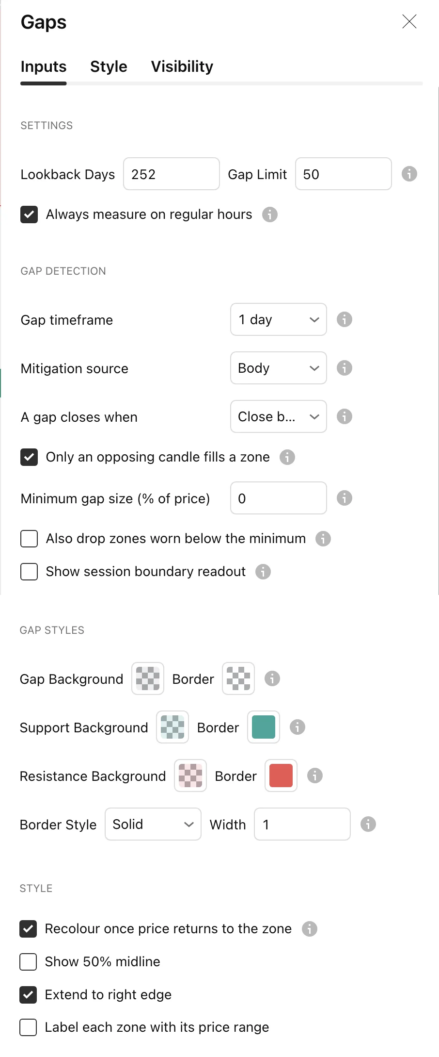
| Setting | Default | What it does |
|---|---|---|
| Lookback Days | 252 | How far back gaps are tracked. 0 removes the limit |
| Gap Limit | 50 | Maximum zones drawn at once |
| Always measure on regular hours | On | Ignore extended-hours bars regardless of chart session |
| Gap timeframe | 1 day | The period a gap is measured across |
| Mitigation source | Body | Body, or full wick range |
| A gap closes when | Close beyond the gap | All-or-nothing, or progressive |
| Only an opposing candle fills a zone | On | Progressive mode only |
| Minimum gap size (% of price) | 0 | Filter out tiny gaps |
| Also drop zones worn below the minimum | Off | Remove zones eaten below the threshold |
| Show session boundary readout | Off | Diagnostic — see below |
| Gap / Support / Resistance colours | Grey / teal / red | Background and border for each state |
| Border Style, width | Solid, 1 | Solid, dashed or dotted |
| Recolour once price returns to the zone | On | The three-state colouring |
| Show 50% midline | Off | The middle of each zone |
| Extend to right edge | On | Zones run to the current bar |
| Label each zone with its price range | Off | Prints the boundaries on each zone |
If a gap you expect is missing
Turn on Show session boundary readout. It prints the prices read either side of every session break, the gap it measured, and whether the zone was drawn or rejected. That will tell you immediately whether the gap was filtered out by the minimum size, dropped by the lookback, or never detected at all.
It’s a diagnostic, not a display feature — turn it back off once you’ve found the answer.
FAQ
Which timeframe should I run it on?
Any. The gaps are measured on the gap timeframe, not your chart, so daily gaps show correctly on a 5-minute chart. That’s the point — leave it loaded and it works wherever you are.
Why did a zone stay open when price clearly traded into it?
Two likely reasons. In the default mode nothing partially fills — a session has to close past the far edge, or a body has to cross the whole zone. And with Mitigation source on Body, wicks don’t count.
Why do my zones differ between a regular-hours chart and a 24-hour chart?
They shouldn’t, with “Always measure on regular hours” on. If you turned it off, the indicator follows your chart’s session and overnight bars fill in the gaps.
Some zones are a single thin line.
Those are one-tick gaps. Raise the minimum gap size above 0 to filter them out.
Why is one zone dotted?
That’s the gap belonging to the session still forming. It becomes solid when the session closes.
Does it repaint?
Zones are placed at settled session boundaries and removed when price genuinely closes through them. The current session’s zone is dotted precisely because it isn’t final yet.
Does it work on futures and crypto?
Yes, though instruments trading continuously produce few real session gaps. Equities and ETFs, with a genuine overnight break, are where it earns its place.
Ready for the full engine?
This one is free. The Trade Qualification Engine is the paid suite it was built alongside.