
Overview
Sector maps tell you money moved into Technology. That isn’t actionable — Technology contains quantum computing and it contains enterprise software, and on any given week one can be up 6% while the other is flat.
This map is built at the level people actually trade. Twenty-four themes — nuclear, space, rare earths, data centres, cybersecurity, biotech — ranked strongest to weakest, colour-graded, on whatever chart you already have open.
The workflow it supports is straightforward: find the theme, then find the name. A breakout in a stock inside the strongest theme on the board is a different proposition from the same breakout inside the weakest one.
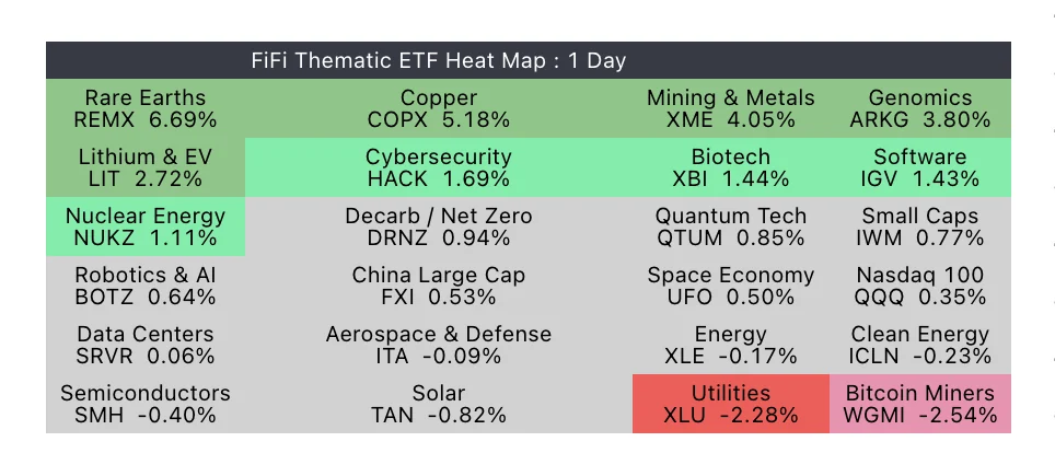 One day’s rotation. Metals and materials leading, utilities and miners at the bottom, and most of the board grey because most of the board isn’t doing anything.
It ignores your chart symbol. The values come from the ETFs themselves, so the map reads identically on every chart and every timeframe. Load it once on a layout and leave it.
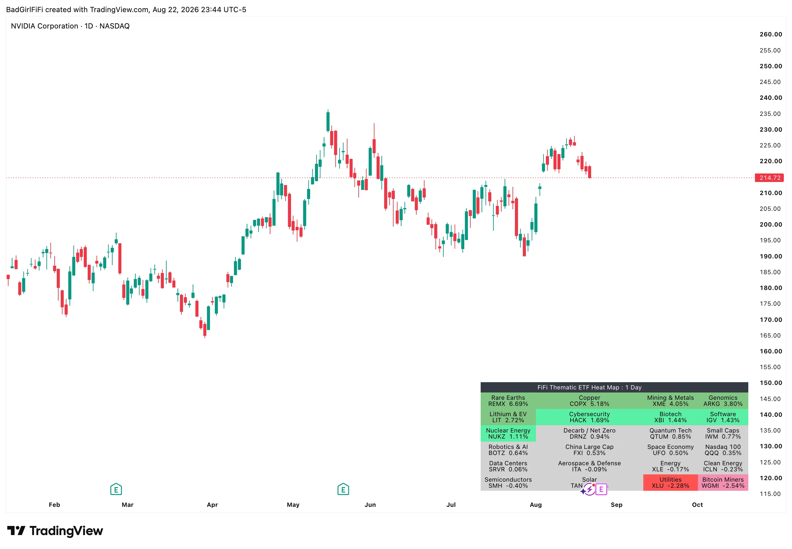 In place on a chart. It occupies a corner and updates itself.
The twenty-four themes
| Decarb / Net Zero | Space Economy | Genomics | Nuclear Energy |
| Energy | Data Centers | Quantum Tech | Solar |
| Software | Robotics & AI | Mining & Metals | Aerospace & Defense |
| Semiconductors | Cybersecurity | Lithium & EV | Rare Earths |
| Copper | Biotech | Clean Energy | Utilities |
| Small Caps | Nasdaq 100 | China Large Cap | Bitcoin Miners |
Every slot is editable — symbol and name. The list above is a starting point, not a constraint. Swap in the themes you actually rotate between, name them whatever you call them in your own head, and the tile displays your name rather than a ticker.
The inclusion of Small Caps and Nasdaq 100 is deliberate: they’re the reference points. A theme up 2% on a day QQQ is up 2.5% isn’t leading anything.
Reading the map
Tiles are sorted strongest to weakest, left to right and top to bottom. The ranking is positional, so you can read the state of the market without reading a single number.
Each tile carries the theme name, its ticker, and the value. Colour comes from five buckets set by two thresholds:
| Bucket | Range | Reads as |
|---|---|---|
| Deep green | at or above Threshold 2 | Strong move up |
| Light green | between Threshold 1 and 2 | Up, meaningfully |
| Neutral grey | inside ±Threshold 1 | Noise — nothing happening |
| Light red | between −Threshold 1 and −2 | Down, meaningfully |
| Deep red | at or below −Threshold 2 | Strong move down |
The grey band is the point. Without it, a theme up 0.3% paints green and reads as strength when it is really just drift. Grey means nothing is happening here — and on most days, most of the board should be grey. When it isn’t, something real is going on.
Turn on Show rank # if you want the position printed explicitly rather than inferred from layout.
Worked example. In the map above, Rare Earths lead at +6.69% with Copper, Mining & Metals and Genomics behind — a clean materials-and-metals day. Nuclear Energy at +1.11% just clears the neutral band and colours green; Decarb at +0.94% sits just inside it and stays grey. Two themes seventeen basis points apart, on opposite sides of the line, because the line is where “moving” starts.
At the bottom, Utilities at −2.28% and Bitcoin Miners at −2.54% land in different buckets for the same reason.
Two ways to measure
% Change — straight performance. What moved.
RS vs SPY — the theme’s performance minus the benchmark’s. What outperformed.
These answer different questions, and RS is the more useful of the two more often than people expect. On a day the whole market is down 2%, % Change paints the board red and tells you almost nothing. RS tells you which themes held up — and what holds up on a red day tends to lead on the next green one.
Adjust your thresholds when you switch metrics. In RS mode the values are gaps against SPY, not raw moves, so beating the benchmark by 2.5% is a much higher bar than simply rising 2.5%. Tighter thresholds usually read better in RS mode.
Lookback is 1 Day or 5 Day. One day is today’s rotation; five days is the week’s trend and considerably less noisy. The header always states which you’re looking at.
Alerts
Three modes, off by default. All of them use TradingView’s dynamic alerts.
| Mode | Fires when |
|---|---|
| Red→Green | A theme flips from a red bucket to a green bucket |
| Enters Top 3 | The top three themes change |
| Both | Either of the above |
Red→Green is the one to run. A theme crossing from genuinely negative to genuinely positive is rotation happening in real time, and it’s the moment you’d want to start looking at names inside it. It only fires on a full crossing — a theme drifting from −0.4% to +0.4% stays inside the neutral band and stays quiet.
Alerts evaluate on confirmed bars only, so nothing fires on an intrabar wobble that reverses.
Setting one up
- Right-click the chart → Add alert
- Set Condition to FiFi’s Thematic ETF Heat Map
- Choose “Any alert() function call”
- Pick your notification method, then Create
Choose “Any alert() function call.” There’s no named condition in the second dropdown — the message is built by the indicator and names the theme that moved. Set the mode you want in the indicator’s settings first; the alert simply carries whatever it produces.
Layout and appearance
The grid is sized by Tile Columns — four across by default, giving six rows of four. Three columns makes a tall narrow block; six makes a wide strip. Twenty-four tiles divide evenly by 2, 3, 4, 6 and 8, so most column counts fill the grid exactly.
| Setting | Default | What it does |
|---|---|---|
| Metric | % Change | Straight performance, or performance against SPY |
| Lookback | 1 Day | 1 or 5 days |
| Benchmark | SPY | What RS mode measures against |
| Tile Columns | 4 | Grid width — 2 to 8 |
| Text Size | Small | Tiny through Large |
| Tile Padding | 1 | Horizontal space inside each tile |
| Tile Height | 0 | Extra blank lines to make tiles taller |
| Show rank # | Off | Print position on each tile |
| Heatmap Position | Top Right | Any of nine chart positions |
Thresholds, all five bucket backgrounds and their text colours, the border, header and empty-cell backgrounds are all configurable.
Twenty-four tiles is a large object. Top Right is the default because price usually occupies the left of the chart, but on a busy layout consider Tile Columns 6 with Text Size Tiny — a wide, shallow strip stays out of the way better than a tall block.
FAQ
Does my chart symbol affect it?
No. The map reads the ETFs directly, so it shows the same thing on every chart and every timeframe.
Why is a theme grey when it's up?
It’s inside the neutral band — the move is too small to count as one. Small moves aren’t leadership, and colouring them green would make every ordinary day look like rotation.
Can I track different themes?
Yes — all twenty-four slots take any symbol, and each has its own editable name. The tile shows your name, not the ticker’s.
How is this different from the Sector Heat Map?
Sector Heat Map Tiles covers the eleven SPDR sectors — the broad map. This one is built at theme level, where the moves are larger and the names are more tradable. Most people run both: sectors for the backdrop, themes for the hunt.
Should I use % Change or RS vs SPY?
% Change to see what moved. RS to see what led. On a broadly red day, RS is far more informative.
Does it repaint?
No. Values are calculated from daily data with no lookahead.
Where this fits
Every indicator in the engine is documented to the same standard.